The following are two select projects I helped design for Google while at Left Field Labs. Myself and another designer Sophie worked on these from concept & pitch to developer hand-off.
● Agency
Left Field Labs
● Role
Designer

● Project 1
Google for Publishers
Businesses all over the world use Google Ads to bolster their business and drive traffic to their sites. Google for Publishers approached Left Field Labs to redesign their site and highlight the people behind those businesses.

● The ask
The Publisher team had three main goals with the new site. The first, highlight the individual people behind businesses that benefit from Google's Ad program. The second, highlight how Google Ads helped those people, and the third objective was to encourage new users/businesses to share their own story.

● The layout
Google provided us with a folder of case studies they had gathered from real small businesses. We knew these stories would carry the bulk of the weight of the site, so displaying them prominently became the first goal with our wires.
Highlight sections you can click into as well as tags to similar stories encourages exploration and makes it easier for users to discover additional stories that may resonate with them and their business.

● The concept
We developed two different creative concepts and pitched them both to Google. The winner was a simple layout, built on a white backdrop with hand-drawn elements scattered through out the site.
We used stylized squiggle-underlines, hand-drawn icons, and splashes of color to make the site feel more like a journal – all while maintaining the legibility and accessibility Google is known for.

● Must-haves
We made it easy for a user to navigate to "Share" at any time during the experience, and a simple form allowed them to easily submit their own stories for review. Additionally, a responsive site that adapted quickly was made especially possible by the component-based design.


● Dev hand-off
As with all projects, it was important to us to leave detailed notes for our developers. Because the site was built to be managed by the Publisher team, the entire thing was built out in swappable components, making it easy for us to layout and label everything for engineering.

● Project 2
Google Elevate
When I was younger I used to sit in the backseat of my mom's car as she dropped items into the pneumatic tubes at the bank and they got sucked back into the building. I was always fascinated by that mechanism of delivery.
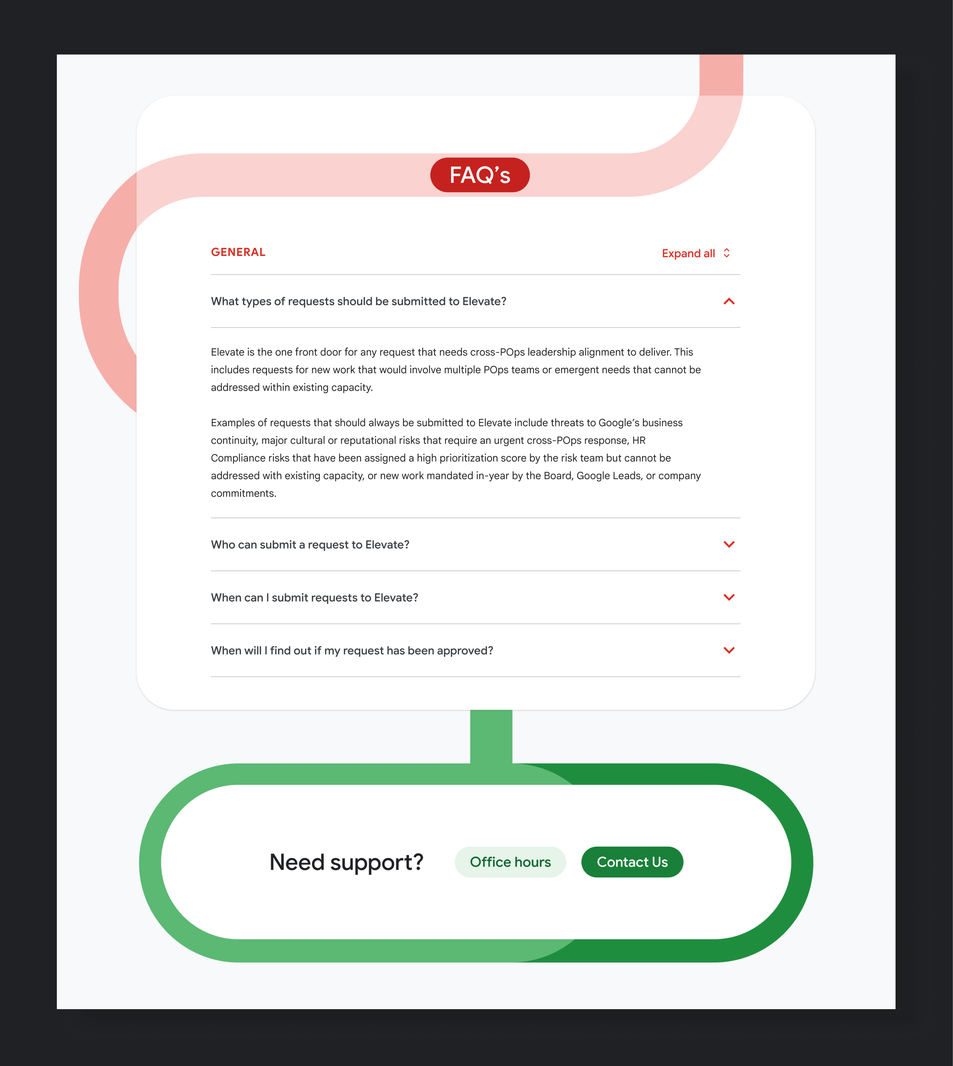
When Google approached us to build out an internal site to help Googlers get their message to the right place those bank tubes came rushing back to my brain. I decided to pitch the idea of these tubes running down the site, with different shapes or "messages" passing through them. Done in Google colors, the tubes help guide the user down the page where they can fill out the relevant information.

One of the biggest UX challenges we were tasked with was creating an easy guide to help Googlers confirm they were in the right place for their request. We decided on a clear, intuitive modal designed to house a questionnaire that could guide users to the correct form.


The rest of the site sought to answer questions, and help Googlers understand how to best get their request approved.

